

Why your website is losing clients in the first 5 seconds is rarely a mystery. Visitors make rapid judgments about trust, relevance, and usability before they read a single paragraph. If your homepage loads slowly, looks outdated, or makes people search for basic information, potential customers may leave before discovering what you offer. Even details such as a confusing Copyright notice can distract from your message when they appear more prominently than your value proposition. The good news is that these problems are measurable and fixable. In this guide, you’ll learn what causes an immediate drop-off, how to improve your website’s first impression, and which practical changes can turn more visitors into leads. For additional conversion advice, explore our guide to website conversion rate optimization.
Why Copyright and First Impressions Matter in the First 5 Seconds
When someone lands on your website, they do not begin by carefully reading your content. Instead, they scan the page and quickly ask: “Am I in the right place?” and “Can I trust this business?” Your design, headline, images, navigation, and loading speed must answer those questions immediately.
A visible Copyright statement is useful for protecting your content, but it should not compete with your primary message. Likewise, a large welcome banner, vague slogan, or intrusive pop-up can push important information below the fold. The first screen should clearly communicate three things:
- What you do: Explain your product or service in plain language.
- Who you help: Identify your ideal customer or audience.
- What visitors should do next: Provide one clear call to action.
For example, “Innovative Digital Solutions for Modern Businesses” sounds polished but says very little. “We build fast, conversion-focused websites for local service companies” is more specific and immediately relevant. Clarity reduces hesitation, while a focused layout gives visitors a reason to continue.
Speed Is Part of Your First Impression
A slow website can lose clients before your design has a chance to work. Large images, unnecessary plugins, unoptimized videos, and unreliable hosting are common causes of poor performance. Test your website on both mobile and desktop using tools such as Google PageSpeed Insights. Compress images, remove unused scripts, enable caching, and consider a faster hosting provider. A few seconds of improvement can significantly reduce early exits.
Four Website Problems That Drive Clients Away
Although every business is different, most first-impression failures fall into a few familiar categories. Reviewing these issues from a visitor’s perspective can reveal why your website is underperforming.
1. An Unclear Value Proposition
Your headline should tell visitors what they gain, not merely describe your company. Avoid internal terminology, clever wordplay, and broad claims such as “quality you can trust.” Instead, emphasize a specific outcome. A law firm might say, “Experienced Employment Lawyers Helping Small Businesses Resolve Workplace Disputes,” rather than simply “Legal Excellence.”
2. Weak or Confusing Navigation
Visitors should be able to find your services, pricing guidance, contact details, and key information without effort. Too many menu items create friction, while vague labels such as “Solutions” or “Resources” may leave people guessing. Keep your main navigation focused and use descriptive labels. On mobile devices, make sure the menu opens reliably and that buttons are easy to tap.
3. Poor Mobile Experience
Most website traffic now comes from mobile devices, yet many businesses still design primarily for desktop screens. Text that is too small, buttons placed too closely together, horizontal scrolling, and forms that are difficult to complete can instantly damage trust. Test your most important pages on several phones. A responsive layout is not an optional feature; it is a basic expectation.
4. Missing Trust Signals
People are cautious about sharing their contact information or spending money online. Add relevant evidence near your primary call to action, including customer reviews, recognizable certifications, client logos, guarantees, case studies, or clear contact information. Avoid fake-looking testimonials or excessive badges. One specific, credible review is more persuasive than a crowded wall of generic praise.
How to Improve Your Website’s First 5 Seconds
Improving your homepage does not always require a complete redesign. Start by making the first screen more useful, focused, and reassuring.
Create a Clear Visual Hierarchy
The most important element should be the easiest to notice. Use a strong headline, a short supporting sentence, and one prominent button. Your button might say “Book a Free Consultation,” “Get a Quote,” or “View Our Services.” Avoid presenting several competing calls to action because visitors may choose none of them.
Use whitespace to separate sections and guide the eye. Choose readable fonts, sufficient color contrast, and images that support your message. Stock photos that look staged or unrelated can reduce credibility. Whenever possible, show your team, work, product, or real customer outcomes.
Make the Next Step Feel Easy
Visitors should not need to commit to a long form or navigate five pages to contact you. Ask only for essential information at first, such as a name, email address, and brief description of the need. Explain what happens after submission. For example, “We’ll respond within one business day” reduces uncertainty and encourages action.
Also review your error messages, confirmation pages, and phone links. A beautiful homepage cannot compensate for a broken contact form. For more ideas, see our article on improving website user experience.
Real Example: Turning a Confusing Homepage into a Lead Generator
Consider a fictional commercial cleaning company whose homepage opened with a full-screen video, a vague slogan, and a small “Contact” link in the top corner. The page looked modern, but visitors could not immediately tell whether the company served offices, retail stores, or private homes. The video also loaded slowly on mobile devices.
The company made four simple changes:
- Replaced the slogan with “Reliable Office Cleaning for Businesses in Austin.”
- Added a visible “Request a Free Quote” button above the fold.
- Replaced the background video with a compressed image of the team at work.
- Added three concise testimonials and a service-area statement.
These changes did not alter the company’s services or pricing. They simply made the website easier to understand and trust. As a result, visitors had a clear reason to continue and a simple way to take action. This illustrates an important point: losing clients in the first 5 seconds is often caused by communication problems, not a lack of business value.
Conclusion: Stop Losing Clients Before They See Your Value
Your website has only a brief opportunity to earn attention. A clear message, fast loading time, mobile-friendly design, focused navigation, and visible trust signals can transform that opportunity into a meaningful conversation. Review your homepage as if you were a first-time visitor: What does the business do? Who is it for? What should you click next? If those answers are not obvious, your site is creating unnecessary friction.
Start with one improvement today. Rewrite the main headline, simplify the navigation, test your mobile layout, or repair a slow contact form. Then measure changes in engagement, bounce rate, and lead submissions. If you need help creating a stronger first impression, contact our team for a website audit and practical conversion recommendations.
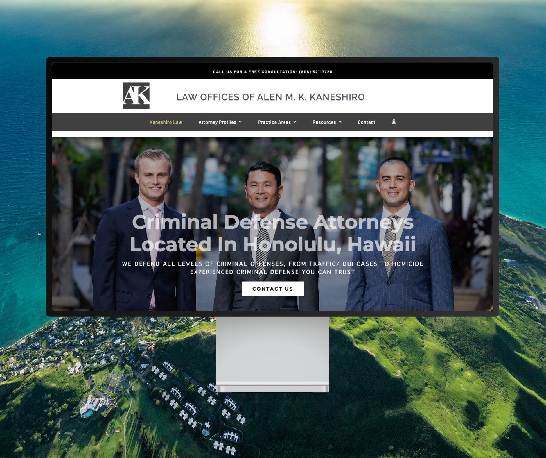
Featured Website: www.kaneshirolaw.com
Kaneshiro Law Firm, one of Hawaii’s most respected legal practices, partnered with The X Digital three years ago for a complete website redesign. Since then, we’ve maintained an ongoing relationship—handling updates, optimizations, and technical support around the clock. Our dedicated team ensures they’re never without assistance, while our enterprise-grade hosting provides 24/7 uptime monitoring and reliability. Kaneshiro Law Firm is one of many long-term clients who trust us to keep their digital presence running flawlessly.