

Your app icon is often the first thing a potential customer sees—and sometimes the only thing they notice before deciding whether to keep scrolling. In that tiny square, people form an instant opinion about your product’s quality, usefulness, trustworthiness, and relevance. That’s why an app icon is more than decoration. It’s your first sales pitch.
Whether you’re launching a new mobile app, refreshing an outdated brand, or trying to improve App Store downloads, your icon deserves the same strategic attention as your name, screenshots, and description. In this guide, we’ll explain why app icons matter, what makes effective app icon design work, how Apple and Google evaluate icons, and the practical steps you can take to create a mobile app logo that earns attention without making exaggerated promises.
Why Your App Icon Is Your First Sales Pitch
Think about how people discover apps. They may search for a solution, browse a category, see an advertisement, or receive a recommendation from a friend. In nearly every situation, your app icon appears alongside competing icons, app names, ratings, and screenshots.
At that moment, your icon is doing several jobs at once. It helps someone recognize your brand, signals what your app does, establishes a visual tone, and gives the user a reason to pause. It doesn’t need to explain every feature. However, it should create enough interest and confidence to earn the next action: a tap.
Apple describes the app icon as one of the elements that helps an App Store product page communicate the essence of an app or game. Its guidance specifically places the icon alongside the app name, screenshots, and description as part of the download decision. You can review Apple’s current App Store guidance for app discovery and product pages.
That makes the icon part of your conversion funnel. A conversion funnel is the sequence of steps someone takes from first seeing your app to installing it, signing up, making a purchase, or becoming a recurring user. If the icon looks confusing, generic, outdated, or unrelated to the search intent, people may never reach your product page.
A small image carries a large amount of meaning
Strong mobile app branding is not about cramming a slogan, feature list, or tiny illustration into a square. At small sizes, complexity disappears. What remains is color, contrast, silhouette, shape, and emotional impression.
A professional app icon should answer an unspoken question: “Does this look like something I want?” For a meditation app, that might mean calm colors and generous spacing. For a contractor scheduling app, it might mean clarity, reliability, and a practical symbol. For an e-commerce brand, it may need to feel distinctive enough to be remembered among dozens of shopping apps.
Your icon is not the entire brand, but it is often the first handshake.
What Makes App Icon Design Effective?
There is no single style that guarantees downloads. A colorful gradient may work for one audience and feel untrustworthy to another. A minimalist lettermark may look premium but fail to explain the app’s purpose. Effective app icon design begins with the audience, category, and promise of the product—not with whatever visual trend is popular this month.
1. Make it recognizable at a glance
People often see an app icon at a small size, especially in search results, folders, notifications, widgets, or a crowded home screen. Fine details and long words usually become visual noise.
Start with one clear idea. That could be a distinctive symbol, a simple letterform, or a recognizable object associated with the app’s core benefit. If your icon requires a lengthy explanation, the concept may be too complicated.
2. Use contrast intentionally
Contrast helps an app store icon stand out from its surroundings. It also improves legibility for people using different screen settings, backgrounds, and display sizes. A pale symbol on a pale background may look elegant in a design file but disappear in an App Store search result.
Test your icon in realistic conditions:
- At its smallest practical size
- Beside direct competitors
- Against both light and dark backgrounds
- With and without the app name visible
- On an actual phone rather than only on a desktop monitor
Viewing it beside competing icons is especially important. An icon that looks attractive by itself may blend into a category when surrounded by similar colors, shapes, or symbols.
3. Design for the platform, not against it
Apple’s current Human Interface Guidelines list 1024 by 1024 pixels as the layout size for iOS, iPadOS, and macOS app icons. Apple also applies system masking and generates smaller versions for locations such as Settings and notifications. That means your artwork needs to remain clear when reduced and displayed in different contexts. See Apple’s official app icon design guidelines for current platform specifications.
Android has its own requirements and presentation rules. Google Play states that the icon appears in several important locations, including the Store Listing, search results, and top charts. Google currently requires a 512-by-512-pixel PNG with a maximum file size of 1 MB for the store listing icon. Its Google Play preview asset guidance also warns developers to avoid misleading badges, rankings, prices, or promotional claims.
The practical lesson is simple: create a flexible master design, then prepare platform-specific files correctly. Don’t assume one exported image will look equally good everywhere.
Your Icon Builds Trust Before Your Description Does
People make fast judgments online. An app icon that appears unfinished can make the entire product seem unfinished. That may not be fair, but it is how digital buying decisions work. Users can’t inspect your code, customer support process, security controls, or development roadmap before downloading. They rely on visible signals.
Your app icon becomes one of those signals. It can suggest that your product is established, current, easy to use, secure, playful, professional, or designed for a particular type of customer.
Consistency matters more than cleverness
A mobile app logo should feel connected to the rest of your brand. Use a recognizable color family, visual language, or symbol system across your website, social profiles, advertising, and app store listing.
However, consistency does not mean copying your website logo exactly. A horizontal logo may be unreadable inside a square. A detailed emblem may lose its meaning when reduced. In some cases, the best app icon is a simplified version of the broader brand identity.
Ask whether someone who sees the icon on their phone will recognize it later in an email, advertisement, or website header. That kind of recognition is valuable because it reduces friction. People are more comfortable choosing something that feels familiar.
Avoid visual promises you can’t keep
Google Play’s metadata policy specifically restricts icons and other metadata from suggesting rankings, pricing, promotions, or an association with Google Play programs. The policy also prohibits misleading symbols, such as download indicators for an app unrelated to downloading content. You can review the Google Play metadata policy before publishing or redesigning your icon.
Even when a design technically passes review, misleading visual language can damage trust. A badge that implies “number one” may attract a tap, but it can also create skepticism. Long-term conversion is built on matching the user’s expectations—not on winning one moment of attention.
For local businesses and service companies, the same principle applies. If you’re building an app for bookings, deliveries, rentals, wellness, or customer communication, the icon should reinforce the experience you want customers to have. Clear and dependable usually beats flashy and vague.
How to Improve an Existing App Store Icon
You don’t always need a complete rebrand. Sometimes a few strategic changes can make an existing app icon more visible and more relevant. Before redesigning it, look at the data and identify where users are dropping out.
If your app receives impressions but few people visit the product page, the icon, app name, category relevance, or search positioning may need attention. If people visit the product page but don’t install, the screenshots, description, reviews, pricing, or onboarding promise may be the larger issue. The icon matters, but it is one part of the wider sales pitch.
Use testing instead of personal preference
App icon decisions often become subjective. Founders prefer one color. Designers prefer another. A developer likes the version that feels most “technical.” None of those opinions can tell you what prospective users will do.
Apple provides Product Page Optimization tools that allow developers to test different app icons, screenshots, and app previews against the original product page. Apple’s own example reports an 8% conversion rate increase for one tested treatment with more than 98% confidence. Its Product Page Optimization documentation explains how these tests work.
Testing does not mean changing your icon every week. It means forming a clear hypothesis and measuring the result. For example:
- “A higher-contrast background will improve visibility in search results.”
- “A simpler symbol will help users understand the app category faster.”
- “Using our primary brand color will improve recognition from advertising.”
Change one major variable at a time where possible. Otherwise, you may learn that the new version performed better without knowing why.
Run a practical icon audit
Before paying for a complete redesign, review your current icon with these questions:
- Can someone understand its basic personality in one second?
- Does it remain recognizable at a small size?
- Does it stand apart from nearby competitors?
- Does it look current on both iOS and Android?
- Does it match the actual experience inside the app?
- Would a returning customer recognize it immediately?
Ask several people who are not involved in the project to describe what they think the app does. Don’t correct them immediately. Their first reactions may reveal confusion that your internal team has stopped noticing.
App Icon Best Practices for a Stronger Launch
Good app icon design starts before the final artwork is delivered. Include the icon in your launch planning, not as an afterthought once the app is ready for submission.
Build a small set of concepts around different strategic directions: one focused on the product benefit, one focused on brand recognition, and one focused on emotional appeal. Compare them at actual size and in realistic store layouts.
Keep the working files editable and retain versions for different platforms. Your team may need alternate treatments for dark mode, seasonal campaigns, product updates, or future brand extensions. Apple supports alternate icon configurations, but all variants still need to follow its review and design requirements.
Most importantly, connect the icon to the rest of the store listing. The icon, app name, screenshots, preview video, and description should feel like one coordinated message. If the icon promises a polished business tool but the screenshots look dated, the listing creates doubt. If the icon is playful but the onboarding experience is formal and complicated, the brand feels disconnected.
At The X Digital, we see the same pattern in website projects: the first visual impression cannot repair a confusing offer, but a poor first impression can prevent people from discovering the value that comes after it. Your app works the same way.
Conclusion: Treat Your App Icon Like a Revenue Asset
Your app icon is small, but its business role is not. It appears in discovery, search, rankings, advertising, customer devices, and conversations between users. It helps people decide whether your app looks relevant and trustworthy before they read the details.
The best icon is not necessarily the most artistic or expensive. It is the one that is recognizable, distinctive, technically correct, aligned with your brand, and honest about the experience inside the app.
If your downloads have stalled, start by reviewing the complete first impression: icon, name, screenshots, ratings, and description. Test improvements where the platform allows it, and judge designs at the size customers actually see them. A thoughtful app icon won’t replace a useful product—but it can help more of the right people take the first step.
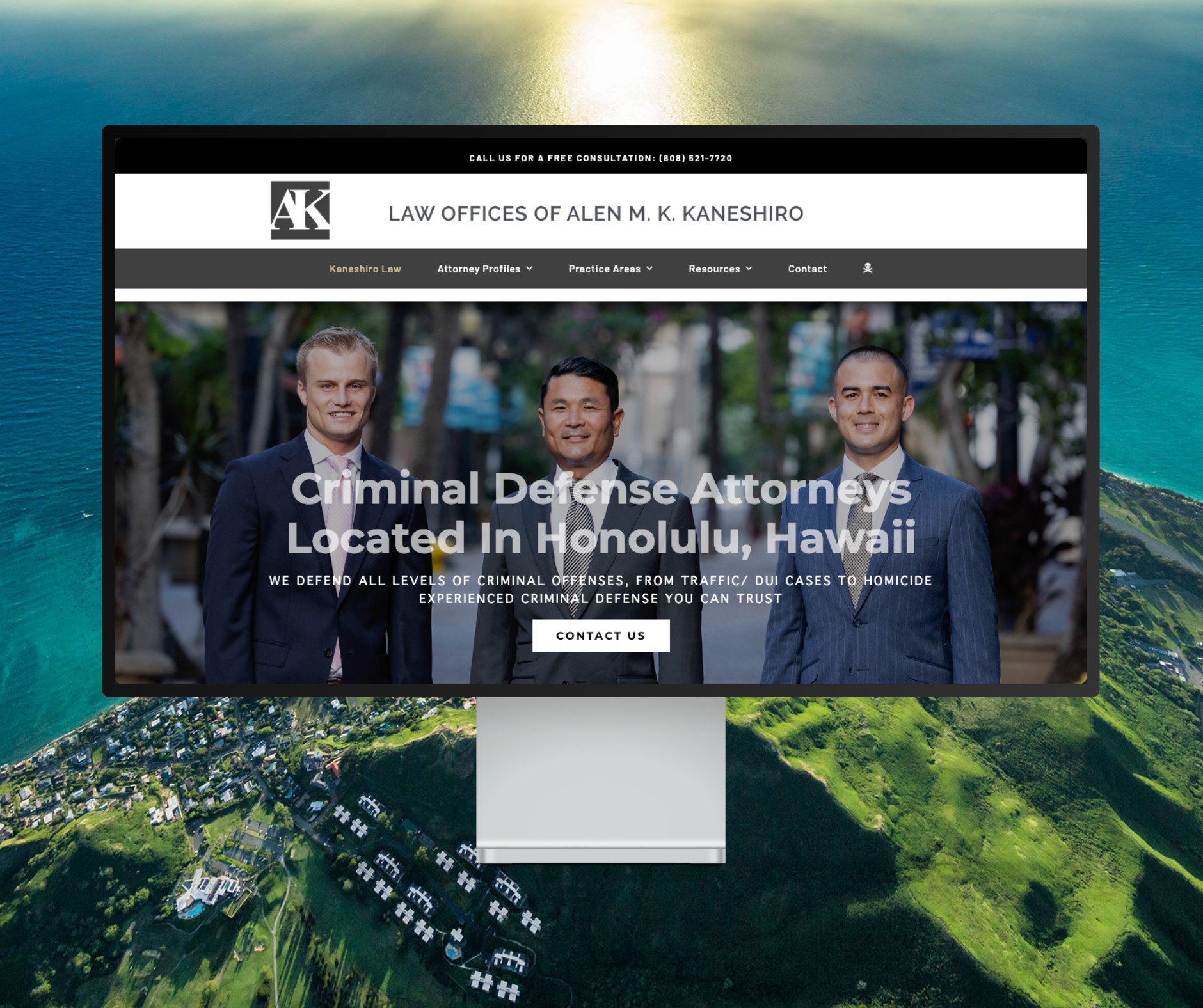
Featured Website: www.kaneshirolaw.com
Kaneshiro Law Firm, one of Hawaii’s most respected legal practices, partnered with The X Digital three years ago for a complete website redesign. Since then, we’ve maintained an ongoing relationship—handling updates, optimizations, and technical support around the clock. Our dedicated team ensures they’re never without assistance, while our enterprise-grade hosting provides 24/7 uptime monitoring and reliability. Kaneshiro Law Firm is one of many long-term clients who trust us to keep their digital presence running flawlessly.