

AI-built websites all look identical—and that’s becoming a real business problem. You’ve probably seen the pattern: oversized headline, rounded cards, soft gradients, generic stock photography, three feature columns, and a button that says “Get Started.” The site may be clean and functional, but it could belong to almost any company in your industry.
That sameness isn’t just an aesthetic complaint. Your website is often the first place a potential customer decides whether your business looks credible, established, and worth contacting. If your site feels interchangeable with five competitors, you make it harder to remember, easier to dismiss, and more expensive to convert visitors into leads. In this article, we’ll explain why AI website builder templates tend to converge, how generic AI web design affects trust and conversions, and what a better approach looks like for professional web design in 2026.
Why AI-Built Websites All Look Identical
AI website builders are remarkably good at producing a usable first draft. Give one a business name, a description, and a few services, and it can generate a homepage, navigation, color palette, images, and basic copy in minutes.
The problem is that “usable” is not the same as “distinctive.” Most AI tools are designed to make safe, familiar choices. They draw from common layouts, popular component libraries, existing templates, and patterns that have already performed reasonably well elsewhere. The result is rarely a bold interpretation of your business. It’s usually a polished average of what websites in your category already look like.
A recent experiment from Morphic illustrates the issue. The company evaluated 17 independently created homepages for the same business. The pages varied in colors, typography, diagrams, and layouts, yet they still clustered into roughly five broader creative families. In other words, AI can generate visual differences without generating genuinely different ideas. You can read the Morphic analysis of AI-generated website similarity for the full discussion.
AI optimizes for acceptable, not meaningful
When you prompt an AI tool to “make a modern website for a local roofing company,” it has to fill in a lot of blanks. What does “modern” mean? What should the company sound like? What makes its service different? Why should a homeowner trust it instead of the next roofer?
Unless you provide strong answers, the system relies on familiar defaults. That often means:
- A large hero section with a vague value proposition
- Blue, purple, black, or neutral color schemes
- Rounded buttons and cards
- Generic stock photos or AI-generated images
- Short sections with broad, interchangeable claims
- A repeated “Contact Us” or “Get Started” call to action
None of those elements is automatically bad. In fact, familiar patterns can improve usability. The problem begins when every business uses the same patterns without adding a reason for customers to choose one company over another.
Templates multiply sameness
AI website builder templates create another layer of repetition. The tool may generate different text and images, but the underlying structure often remains the same. Change the logo and headline, and the site can still feel like a cousin of hundreds of other websites built on the platform.
This is why changing your colors alone rarely solves the problem. A green version of the same template is still the same template. Real differentiation comes from the combination of strategy, content, imagery, layout, proof, and user experience—not from swapping a button color.
Generic AI Web Design Can Weaken Trust Before You Say a Word
Most business owners think of design as decoration. Visitors don’t. They use design as evidence.
Before someone reads your service list or studies your pricing, they’re forming an impression based on visual quality, clarity, and apparent credibility. The Nielsen Norman Group’s research on ecommerce trust and credibility emphasizes that visual design and the overall site experience influence whether users are willing to spend time, money, or personal information on a website. Its research on website trust and credibility is especially relevant for businesses that depend on leads or online sales.
A generic site creates several problems at once:
- It makes you look interchangeable. If your website looks like every competitor’s, your business feels easier to replace.
- It reduces perceived expertise. A template can suggest that little thought went into the customer experience.
- It weakens your brand memory. Visitors may remember the category, but not your company.
- It forces your sales process to work harder. If the website doesn’t establish trust, your phone call or sales conversation has to repair that gap.
This matters particularly for local service businesses, professional services, healthcare providers, contractors, and companies selling products that require consideration. Customers are not only asking, “Can this company do the job?” They’re also asking, “Does this company understand my situation? Will they follow through? Can I trust them with my money, home, health, or business?”
Professional does not mean bland
Many AI tools interpret “professional” as conservative and familiar. That can lead to a website that looks clean but has no personality. Yet professional design is not about making every company look the same. It’s about making the right impression for the right audience.
A luxury rental company, emergency plumber, senior care provider, and financial consultant should not share the same visual language. They may all need fast loading, clear navigation, and prominent contact information, but the emotional context is different.
Good design makes those differences visible. It uses real photography when relationships matter, specific proof when risk is high, and a clear visual hierarchy that guides visitors toward the next step. It also respects the customer’s questions instead of forcing every visitor through the same generic sales funnel.
The Cost of Looking Like Everyone Else
The financial cost of a generic website is rarely visible as a single line item. It appears as wasted traffic, lower response rates, missed opportunities, and more expensive advertising.
1. You pay to attract attention, then waste it
Whether visitors find you through Google, social media, referrals, or paid advertising, getting someone to your website costs time or money. If the landing page doesn’t quickly communicate who you help, what makes you different, and why the visitor should believe you, that investment is less productive.
A website does not need to be unusual for the sake of being unusual. It needs to be relevant. A visitor should immediately see evidence that the site was built for people like them—not assembled from a generic prompt.
2. You compete on price when you should compete on value
When two companies look and sound alike online, customers often fall back on the easiest comparison: price. Distinctive positioning gives people another reason to choose you. That could be specialized experience, a better process, faster response times, stronger guarantees, local knowledge, better materials, or a more convenient customer experience.
If the website doesn’t explain those advantages clearly, you may end up discounting to overcome a problem that better messaging and design could have prevented.
3. You create expensive rework
Many business owners use an AI builder to get something online quickly, then discover that changing the site is harder than expected. The copy is too generic, the layout doesn’t support new services, the forms don’t connect properly, or the design cannot accommodate real photography and customer proof.
At that point, the “cheap” website may require a second build. Someone has to rewrite the content, restructure the pages, repair technical issues, improve mobile layouts, and make the site look like a real business rather than an AI demonstration.
AI can reduce production time, but it cannot remove the need for decisions. Skipping strategy at the beginning often means paying for strategy and reconstruction later.
Custom Web Design vs AI: It’s Not an Either-Or Decision
The real question is not whether AI should be used in web design. It should. The better question is where AI helps and where human judgment is still essential.
AI is useful for research organization, content outlines, first-draft copy, code assistance, image concepts, accessibility checks, content repurposing, and routine production tasks. Used properly, it can help a small business move faster without adding a large team.
What AI should not be allowed to decide by itself is the entire business strategy. A website needs human direction around positioning, customer psychology, brand voice, information architecture, conversion paths, and proof.
What a stronger process looks like
- Start with customer research. Identify what people ask before buying, what they fear, and why they choose or reject providers.
- Define the business advantage. Turn vague claims such as “quality service” into specific, believable reasons to choose you.
- Build a content structure. Organize pages around real customer intent, not whatever sections an AI tool happens to generate.
- Create a visual direction. Choose typography, photography, color, spacing, and design elements that fit the company and audience.
- Use AI for speed, not identity. Let AI assist with execution while people make the important creative and commercial decisions.
- Test the finished experience. Check mobile usability, forms, page speed, accessibility, analytics, and the clarity of every call to action.
This approach is also better for search. Google’s guidance on page experience makes clear that Core Web Vitals and usability matter, but strong scores alone do not guarantee top rankings. A page still needs useful content and a satisfying experience. Review Google’s page experience documentation for the distinction between technical performance and overall quality.
In other words, a fast generic site is still generic. Speed supports a good website; it does not replace one.
How to Make an AI-Assisted Website Feel Original
You don’t necessarily need an expensive, completely custom website to avoid looking generic. You do need to customize the parts that customers actually notice and use.
Start by replacing generic assets with real ones. Use original photos of your team, location, products, completed work, vehicles, facilities, or process. Real images often communicate more trust than a polished stock photo because they prove the business exists in the world.
Next, make the copy specific. Explain who you serve, what problems you solve, what happens after someone contacts you, how your process works, and what customers can expect. Specificity is one of the easiest ways to separate your website from AI-generated competitors.
Then look for evidence:
- Customer reviews with context
- Before-and-after examples
- Case studies and measurable outcomes
- Licenses, certifications, awards, or affiliations
- Service-area details
- Clear guarantees and policies
- Frequently asked questions based on real conversations
Finally, remove anything that exists only because the template included it. You may not need six feature cards, a rotating testimonial slider, decorative animations, or a large block of vague mission statement copy. A simpler page with strong evidence can outperform a more elaborate page with no substance.
Conclusion: Use AI to Build Faster, Not to Become Forgettable
AI-built websites all look identical because the tools are trained and structured to make familiar decisions quickly. That makes them useful for prototypes and basic launches, but risky when your website is expected to generate leads, establish trust, and differentiate your business.
The answer is not to reject AI. It’s to use it with direction. Let technology handle repetitive work, while experienced people handle the decisions that affect revenue: positioning, messaging, design, user experience, technical quality, and conversion strategy.
At The X Digital, we use AI because we build with it ourselves. But we also know that a website is more than a collection of generated sections. It is part of your sales process, your reputation, and your long-term marketing system. If your current site could be mistaken for a competitor’s, the next step may not be another template or another prompt. It may be time to build something that actually sounds, looks, and works like your business.
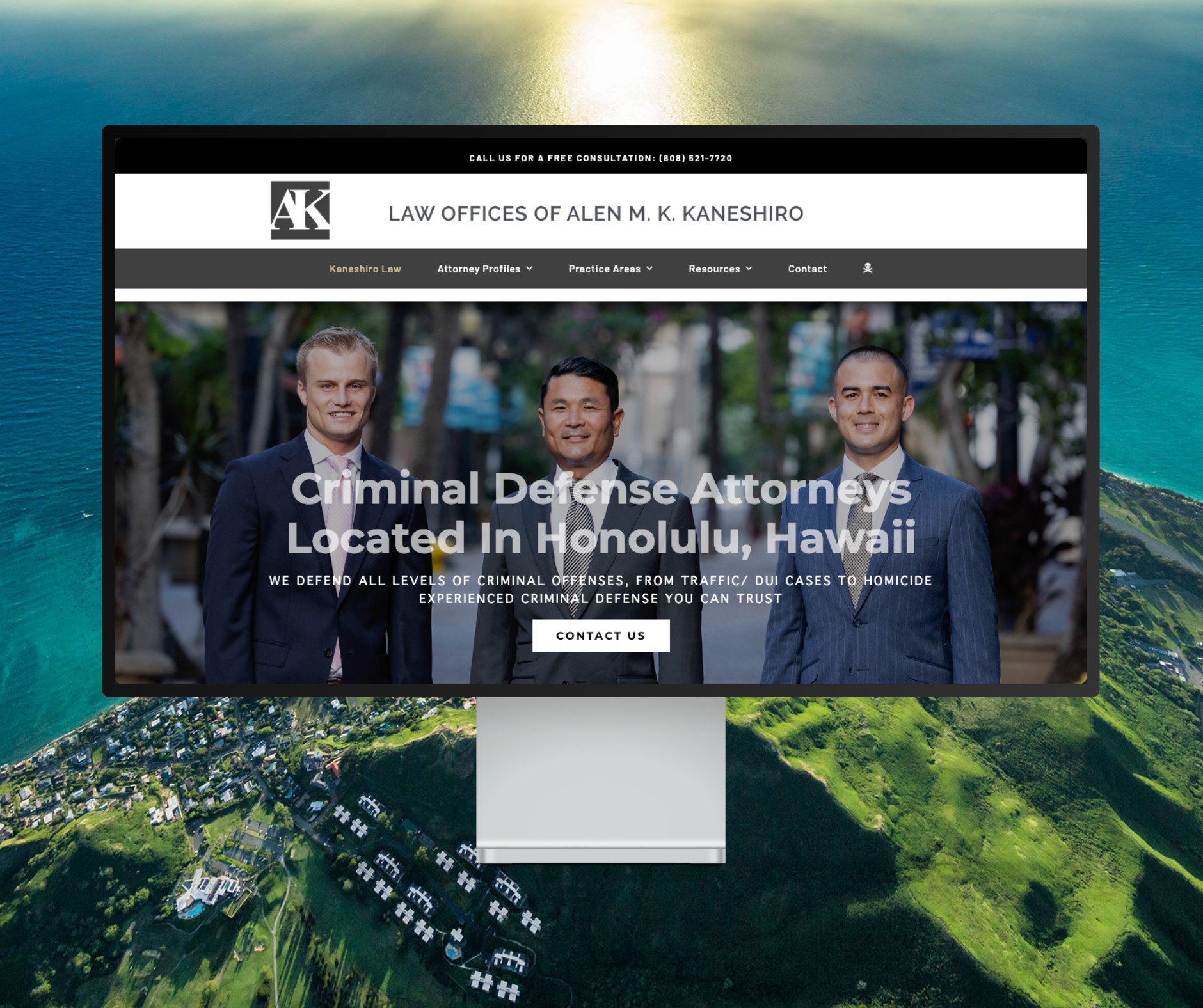
Featured Website: www.kaneshirolaw.com
Kaneshiro Law Firm, one of Hawaii’s most respected legal practices, partnered with The X Digital three years ago for a complete website redesign. Since then, we’ve maintained an ongoing relationship—handling updates, optimizations, and technical support around the clock. Our dedicated team ensures they’re never without assistance, while our enterprise-grade hosting provides 24/7 uptime monitoring and reliability. Kaneshiro Law Firm is one of many long-term clients who trust us to keep their digital presence running flawlessly.