

For a local business, your website may be the first interaction a potential customer has with your company. Increasingly, that interaction happens on a phone while someone is searching from a driveway, a parking lot, or the next neighborhood over. That’s why a mobile-first website strategy is no longer a nice upgrade—it’s a practical requirement for being found, trusted, and contacted online.
A mobile-first approach means designing and building your site around the small-screen experience first, then expanding it for tablets and desktops. In this guide, we’ll explain why mobile matters so much for local businesses, how it affects SEO and user experience, which elements deserve attention, and what you can do first if your current website is difficult to use on a phone.
Why a Mobile-First Website Strategy Matters for Local Businesses
People often search for local services when they have an immediate need. They may search for “plumber near me,” “best lunch in town,” “emergency dentist,” or “vehicle rental near the airport.” In many cases, they’re using a smartphone because that’s the device already in their hand.
That creates a short window for your website to make a good impression. If the page loads slowly, text is difficult to read, or the phone number is buried, the visitor may go back to Google and choose a competitor instead. They probably won’t send you a message explaining what went wrong. They’ll simply leave.
A mobile-first website strategy helps you prioritize the actions that matter most to a local customer, such as:
- Calling your business
- Requesting a quote or appointment
- Getting directions
- Checking hours, availability, or pricing
- Learning whether you serve their location
- Reading reviews and understanding what makes you different
This doesn’t mean desktop visitors are unimportant. Larger screens still matter, especially for professional services, e-commerce, and complex purchases. However, designing for mobile first forces your team to clarify the essential message and remove unnecessary friction. The result is often a better experience across every device.
Mobile visitors are often high-intent visitors
A person browsing your site on a phone isn’t automatically ready to buy, but local mobile searches often carry strong intent. Someone searching for a roofer after a storm, a senior care provider for a parent, or a restaurant open tonight may be close to taking action.
Your site needs to support that intent quickly. Clear contact options, accurate local information, and concise answers can be more valuable than a complicated animation or a long homepage introduction.
Mobile Optimization Directly Affects Local SEO
Google evaluates websites using many signals, including relevance, authority, technical quality, and the experience provided to visitors. Mobile usability is part of that broader picture. Google has also used mobile-first indexing for years, which means it primarily considers the mobile version of a site when crawling and indexing pages.
In simple terms, if your mobile site hides important content, loads poorly, or prevents visitors from using the page, that can weaken both visibility and performance. Mobile optimization isn’t a shortcut to the top of local search results, but ignoring it can make your other SEO work less effective.
What search engines and customers need to find
A strong local business website should make important information easy to access on mobile. That includes your business name, address, phone number, service areas, opening hours, services, and relevant location details. Keep this information consistent with your Google Business Profile and other reputable business listings.
Page speed is another important consideration. Large images, unnecessary plugins, bloated page builders, and poorly configured hosting can make a site feel slow. We’ve seen many businesses invest in content and advertising while sending visitors to a website that takes too long to become usable. Improving hosting, compressing images, removing unused tools, and loading only the scripts you need can make a meaningful difference.
Mobile SEO is more than responsive design
Responsive design allows a website layout to adjust to different screen sizes. It’s essential, but it’s only one part of SEO for mobile. You also need to consider:
- Readable text without pinch-to-zoom
- Buttons and links large enough to tap comfortably
- Forms that are short and easy to complete
- Images that load efficiently
- Content that remains available on smaller screens
- Clear page titles, headings, and internal links
- Secure HTTPS and reliable technical performance
Use Google Search Console and performance testing tools to identify issues, but don’t treat a score as the whole goal. A page can pass a technical test and still frustrate real customers. Test your site on several phones and ask someone unfamiliar with your business to complete a basic task, such as finding your phone number or requesting an appointment.
How Mobile User Experience Influences Conversions
Traffic only has value when your website helps visitors take the next step. That next step might be a phone call, form submission, purchase, booking, or visit to your physical location. This is where mobile user experience and conversions are closely connected.
On a small screen, every element competes for attention. If your header is crowded, your main call to action is unclear, or your contact form asks for too much information, visitors have more opportunities to give up. A mobile-first design makes the path forward obvious.
Build around real customer actions
Start by identifying what your best customers typically want to do. A cleaning company may need a “Get a Quote” button. A restaurant may need “View Menu” and “Get Directions.” A law firm may want “Schedule a Consultation.” A rental business may need availability and booking information immediately visible.
Once you know the primary action, give it appropriate prominence. A phone number can be clickable on mobile. A sticky contact button can remain accessible as visitors scroll. A booking form can be broken into manageable steps instead of presenting one intimidating wall of fields.
However, avoid turning every section into a sales pitch. Helpful information builds confidence. Explain your process, service area, availability, pricing approach, guarantees, qualifications, and frequently asked questions. Customers want to know what happens after they contact you, especially when they’re comparing several local providers.
Reduce friction and build trust
Good mobile design answers questions before a visitor needs to ask them. It also removes uncertainty. Consider including:
- Real customer reviews and testimonials
- Photos of your team, work, location, or products
- A clear service area or delivery range
- Expected response times
- Simple explanations of your process
- Secure payment or booking indicators where relevant
- Links to your privacy policy and other important policies
Trust is particularly important for local service businesses. Visitors may be inviting you into their home, relying on you during an emergency, or spending a significant amount of money. A polished mobile experience won’t replace excellent service, but it can help communicate professionalism before the first conversation.
What a Local Business Website Should Include on Mobile
There is no universal layout that works for every industry. A contractor, medical practice, tour operator, and online store have different customer journeys. Still, most effective local websites share a set of practical fundamentals.
Make the first screen useful
When a page opens, the first visible area should quickly communicate three things: what you do, where you do it, and what the visitor should do next. For example, “Residential plumbing services in Honolulu” is more useful than a vague slogan such as “Quality You Can Trust.” A supporting sentence can explain the benefit, while a prominent button directs the visitor to call, book, or request a quote.
Don’t force visitors to scroll through a large image, autoplay video, or generic welcome message before they can find basic information. Visuals matter, and professional photography can significantly improve credibility, but they should support the message rather than delay it.
Design navigation for thumbs, not mouse pointers
Desktop menus often become awkward on phones. Keep navigation short and organize it around customer needs. Core pages might include Services, About, Reviews, Service Areas, FAQs, and Contact. Use descriptive labels instead of clever wording that makes visitors guess where a link leads.
Touch targets should have enough space around them so users don’t accidentally select the wrong item. Forms should use appropriate mobile keyboard types—for example, a numeric keyboard for phone numbers—and provide clear error messages when something is missing.
Use local content that is genuinely helpful
Local SEO content should do more than repeat a city name several times. Create pages or sections that explain the areas you serve, the problems customers in those areas face, and how your business helps. Mention nearby communities naturally where relevant, but don’t create dozens of nearly identical pages with little original value.
For businesses with multiple locations, each location page should include accurate local details, unique descriptions, relevant staff or services, and a clear way to contact that specific location. Thin, duplicated pages can confuse both users and search engines.
How to Start Improving Your Mobile Website
You don’t always need a complete rebuild to make progress. Begin with a practical audit of the current experience. Open your site on your own phone using a mobile connection, not just office Wi-Fi. Try to complete the most important customer actions. Note where the site feels slow, confusing, or difficult to use.
Then prioritize improvements based on business impact. Fixing a broken contact form or making your phone number tappable may produce more value than redesigning a low-traffic page.
- Check the basics: Confirm that your phone number, hours, address, forms, and directions work correctly.
- Test speed: Compress oversized images, review plugins and scripts, and check whether your hosting can handle your traffic.
- Clarify the primary call to action: Decide whether customers should call, book, buy, or request a quote.
- Review your content: Put the most important answers near the top and remove unnecessary filler.
- Test across devices: Check current iPhones and Android phones, different browsers, and both portrait and landscape views.
- Measure results: Monitor calls, form submissions, bookings, sales, engagement, and organic search performance.
If the site is built on WordPress, keep the core software, theme, and plugins updated. Use dependable security and backups, and make changes in a controlled way. A fast design can still become slow if new plugins, tracking tools, and large media files are added without review.
At The X Digital, we look at mobile design as part of the entire revenue system—not as an isolated visual exercise. That means considering hosting, technical SEO, content, analytics, conversion paths, and ongoing maintenance together. The best strategy is the one your business can support and improve over time.
Conclusion: Make Mobile the Starting Point
A mobile-first website strategy helps local businesses meet customers where searches and decisions increasingly happen. It can improve the user experience, support SEO for mobile, reduce wasted traffic, and create more opportunities for calls, bookings, purchases, and inquiries.
The goal isn’t to cram every possible feature onto a phone screen. It’s to make your website fast, clear, trustworthy, and easy to use for the people most likely to become customers. Start with the basics: accurate information, simple navigation, strong local content, a clear call to action, and a reliable technical foundation.
If your current local business website is difficult to use on a phone, don’t wait for a perfect redesign before making improvements. Fix the highest-impact problems first, measure what changes, and build from there. A thoughtful mobile optimization plan can turn more of the traffic you already receive into real business.
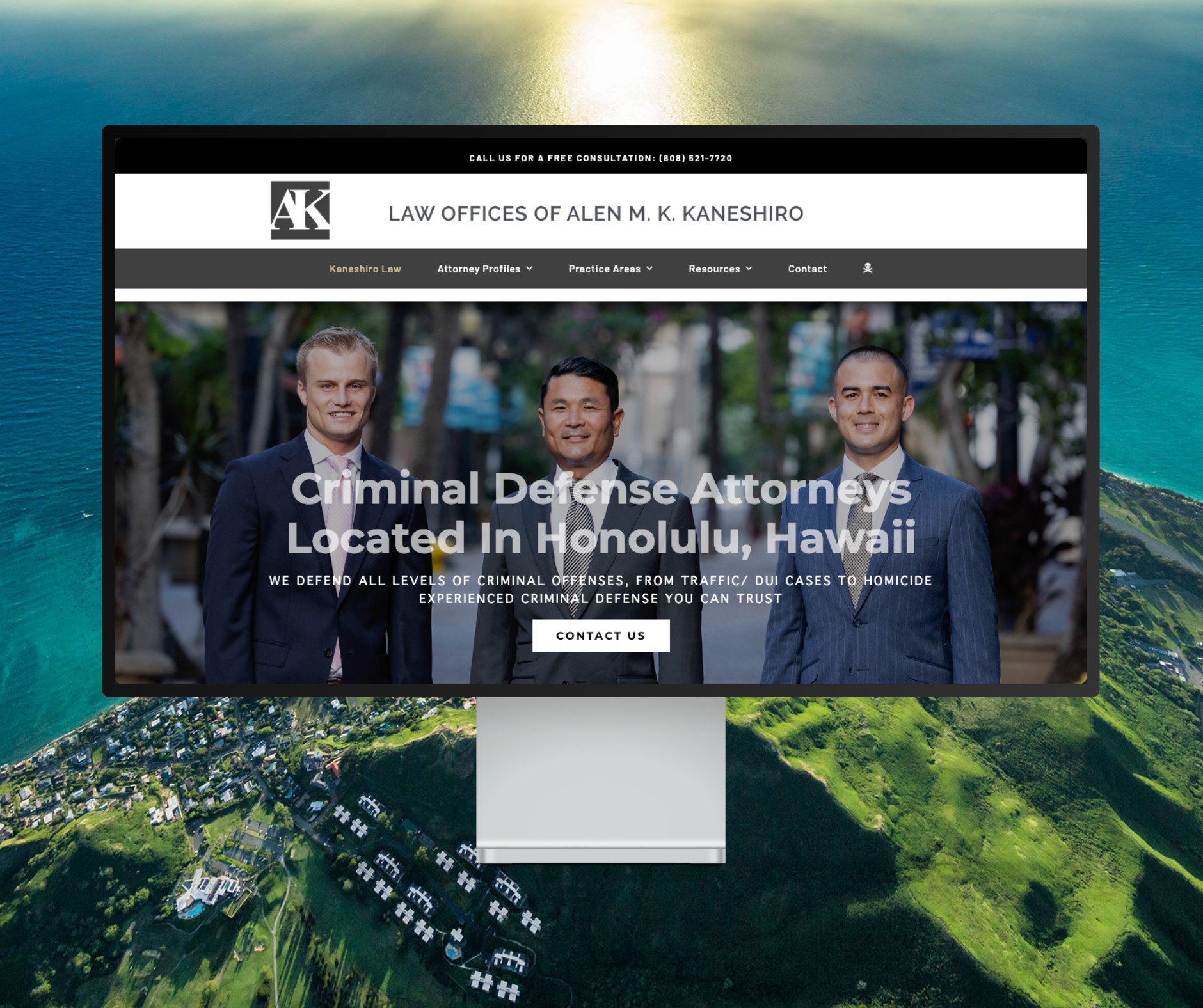
Featured Website: www.kaneshirolaw.com
Kaneshiro Law Firm, one of Hawaii’s most respected legal practices, partnered with The X Digital three years ago for a complete website redesign. Since then, we’ve maintained an ongoing relationship—handling updates, optimizations, and technical support around the clock. Our dedicated team ensures they’re never without assistance, while our enterprise-grade hosting provides 24/7 uptime monitoring and reliability. Kaneshiro Law Firm is one of many long-term clients who trust us to keep their digital presence running flawlessly.