

Google Ads landing pages can make or break an otherwise well-managed campaign. You can target the right audience, write compelling ads, and bid on valuable keywords—but if the page is slow, confusing, or disconnected from the ad, clicks rarely become customers. That’s one of the most common reasons businesses see rising costs and disappointing results from Google Ads.
The good news is that you usually don’t need a complete website rebuild. A focused round of landing page optimization can remove the friction that stops people from calling, booking, requesting a quote, or buying. In this guide, we’ll cover nine practical fixes for Google Ads landing pages, including message matching, mobile performance, trust signals, forms, calls to action, and conversion tracking. These are the same fundamentals we look at when helping small and mid-sized businesses improve PPC landing pages and turn more paid traffic into measurable revenue.
Google Ads Landing Pages Need One Clear Job
The first mistake is treating a landing page like a general homepage. A homepage may need to introduce your company, showcase multiple services, and guide visitors toward several sections. A Google Ads landing page has a narrower purpose: help a visitor take one specific next step.
1. Match the page to the ad and search intent
When someone searches “emergency air conditioning repair,” clicks an ad promising same-day service, and lands on a generic home services page, the experience feels wrong. Even if you offer the service, the visitor now has to search for confirmation. Many will leave instead.
Message matching means keeping the promise and language consistent from the keyword to the ad to the landing page. For example, the page should repeat important details such as:
- The specific service or product the visitor searched for
- The location or service area, when relevant
- The offer or benefit mentioned in the ad
- The expected next step, such as “Request a Same-Day Quote”
This reassures visitors that they’re in the right place. It can also improve your Google Ads conversion rate because people don’t have to interpret what you do before deciding whether to contact you.
2. Remove competing calls to action
Every additional option creates another opportunity for hesitation. If the goal is to generate phone calls, don’t make the main page equally focused on newsletter signups, social media profiles, five unrelated services, and a long company history.
Choose the primary conversion before writing the page. For a local service business, that might be a phone call or quote request. For an e-commerce campaign, it may be a product purchase. Secondary links can remain, but they should not compete visually with the main action. A focused page is not restrictive; it is respectful of the visitor’s limited attention.
Fix the First Impression on Your PPC Landing Pages
People form an opinion about a page almost immediately. They want to know three things: what you offer, whether it applies to them, and what they should do next. If those answers are buried below a large image or vague headline, your paid traffic is likely leaking away.
3. Write a specific headline and supporting message
Your headline should explain the result or service in plain English. “Premium Solutions for Modern Businesses” sounds polished but says almost nothing. “Book a Licensed Honolulu Electrician” is more useful because it identifies the service and location.
A strong opening section typically includes:
- A direct headline that reflects the search or ad
- A short explanation of the customer benefit
- A visible call to action
- One or two trust signals, such as reviews, credentials, or years in business
Avoid making visitors scroll to discover the basic offer. The top of the page should communicate value without requiring them to study your navigation or decode industry jargon.
4. Put the call to action where people can see it
A call to action, or CTA, is the instruction that tells someone what to do next. “Call now,” “Get a quote,” “Schedule an appointment,” and “Buy today” are all CTAs. The best wording depends on the customer’s level of intent and the amount of commitment involved.
Use a prominent button or phone number near the top of the page, then repeat the CTA after key sections. On mobile devices, a sticky call button can make sense for local businesses. However, don’t use aggressive pop-ups that block the content before visitors understand the offer. Good landing page optimization makes the next step obvious without making the experience irritating.
Reduce Friction Before Asking for the Lead
Many landing pages lose qualified prospects at the moment of conversion. The visitor is ready to inquire, but the form is too long, the phone number is difficult to tap, or the page gives them a reason to worry about what happens next.
5. Simplify your form and offer a useful reason to submit it
Only ask for information your team genuinely needs to respond. A basic quote request may need a name, phone number, email address, and a short description. Adding fields for company size, annual revenue, detailed preferences, and several dropdown menus may reduce submissions—especially when the visitor is on a phone.
Tell people what happens next. For example: “Send your details and a member of our team will call within one business hour.” Specific expectations reduce uncertainty. If response times vary, be honest rather than promising an unrealistic turnaround.
Also check the practical details. Forms should work on mobile, display helpful error messages, and show a confirmation after submission. That confirmation should explain whether someone will call, email, or schedule a follow-up. A form submission that disappears without feedback creates doubt and duplicate submissions.
6. Build trust at the point of conversion
Trust matters most when you’re asking for contact information or payment details. Add proof near the CTA rather than hiding it on an “About” page. Useful trust signals include:
- Verified customer reviews or testimonials
- Years of experience and relevant licenses
- Clear service areas and contact information
- Recognized guarantees, warranties, or certifications
- Secure checkout indicators for e-commerce pages
- Real photographs of your team, work, location, or products
Be precise. “Best in town” is a claim; “4.9 stars from 180 verified reviews” is evidence. Don’t add badges or testimonials that cannot be verified. Experienced customers notice manufactured credibility, and it can hurt your brand more than having fewer trust signals.
Make the Page Fast, Mobile-Friendly, and Measurable
Paid traffic is expensive enough without sending it to a page that loads slowly or fails on a phone. A visitor who waits several seconds for the main content may go back to the search results, where your competitor is one tap away.
7. Improve speed and mobile usability
Review the page on an actual phone using a cellular connection, not only on a fast office Wi-Fi network. Check whether the headline is readable, buttons are easy to tap, images load quickly, and the form fits the screen without awkward scrolling.
Common improvements include compressing oversized images, removing unnecessary scripts, limiting animations, using reliable WordPress hosting, and keeping page builders and plugins under control. Speed work should focus on the experience that affects conversions, not just on achieving a perfect score in an automated tool.
Mobile visitors should not have to pinch and zoom, close multiple pop-ups, or hunt for your phone number. For local businesses, a tap-to-call button is often more valuable than another paragraph of sales copy.
8. Make the page accessible and easy to scan
Clear structure helps everyone, including people using screen readers or navigating with limited vision. Use descriptive headings, sufficient color contrast, readable font sizes, labels for form fields, and meaningful alternative text for important images.
Break long text into short paragraphs and use bullets where they improve clarity. Visitors often scan before they read. Strong visual hierarchy lets them quickly understand your offer, proof, process, and next step.
9. Track conversions accurately
You cannot improve what you cannot measure. A conversion might be a completed form, phone call, appointment booking, purchase, chat conversation, or email click. Configure Google Ads and your analytics platform to distinguish meaningful actions from low-value activity.
For example, counting every visit to a thank-you page as a qualified lead can inflate performance if people reach that page through another path. Likewise, tracking a phone number click is useful, but it does not always prove that a conversation happened. Where possible, connect call tracking, CRM data, and closed sales back to the campaign.
Review both volume and quality. A landing page that produces more leads at a lower cost is not necessarily better if those leads are outside your service area or unlikely to buy. The real goal is profitable customers, not impressive dashboard numbers.
How to Test and Improve Landing Pages for Lead Generation
Once the basic problems are fixed, test one meaningful change at a time. You might compare a specific headline with a broader one, a short form with a longer form, or a “Get My Quote” button with “Request Pricing.” Give the test enough traffic and time to produce a useful sample. Changing five elements at once makes it difficult to know what caused the result.
Start with the highest-impact questions:
- Do visitors immediately understand the offer?
- Does the page fulfill the promise made in the ad?
- Is the primary CTA visible and compelling?
- Can someone convert easily on a mobile phone?
- Do reviews, credentials, or guarantees address likely concerns?
- Are conversions being recorded accurately?
Use Google Ads search terms, analytics behavior, recordings where appropriate, sales-team feedback, and customer conversations to guide your decisions. If visitors repeatedly ask a question, answer it on the page. If many people start a form but abandon it at the same field, investigate whether that field is necessary or confusing.
Landing pages for lead generation should also reflect the buying stage. Someone searching for an emergency repair needs a fast path to contact you. Someone comparing long-term business software may need pricing context, demonstrations, case studies, and a lower-pressure consultation. The best page is not universally persuasive; it is relevant to the person who arrived there.
Conclusion: Turn More Google Ads Clicks Into Customers
Better Google Ads results don’t always require higher bids or a larger budget. Often, the opportunity is already in the traffic you’re buying. Match the page to the ad, clarify the offer, simplify the conversion path, prove that your business is trustworthy, improve mobile performance, and track outcomes beyond the initial form submission.
Start with the most obvious friction point and make one improvement this week. Then review the data and customer quality before making the next change. If your landing pages, tracking, or Google Ads campaign need a second set of experienced eyes, The X Digital can help. We’re a senior, hands-on team that works directly with businesses to build faster websites, improve conversion paths, and turn paid traffic into sustainable revenue.
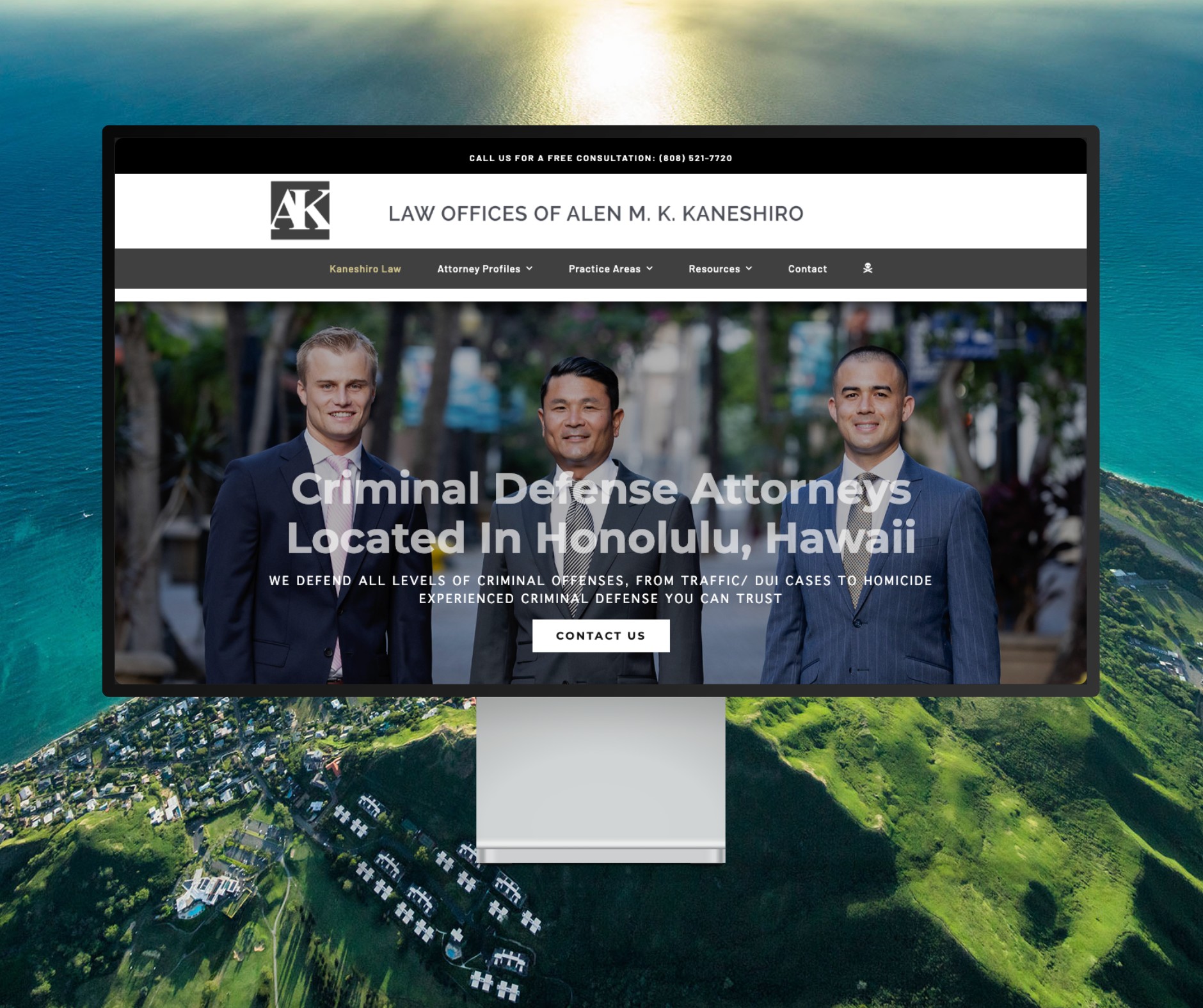
Featured Website: www.kaneshirolaw.com
Kaneshiro Law Firm, one of Hawaii’s most respected legal practices, partnered with The X Digital three years ago for a complete website redesign. Since then, we’ve maintained an ongoing relationship—handling updates, optimizations, and technical support around the clock. Our dedicated team ensures they’re never without assistance, while our enterprise-grade hosting provides 24/7 uptime monitoring and reliability. Kaneshiro Law Firm is one of many long-term clients who trust us to keep their digital presence running flawlessly.