

If you’re wondering, “Is iPad Responsive Design Really Worth It?”, the honest answer is: usually, yes—but not because every business needs a separate iPad layout. The real value is making sure your website works well across phones, tablets, laptops, and larger screens without forcing you to maintain several versions of the same site. For most businesses, iPad visitors are simply part of a broader mobile and tablet audience. What matters most is whether those visitors can read your content, navigate comfortably, contact you, and complete important actions without friction.
In this guide, we’ll explain what iPad responsive design actually means, why tablet-specific thinking can still be useful, and where your budget will produce the best mobile optimization ROI. We’ll also look at what Google prioritizes, which performance issues hurt conversions, and when a business should stop worrying about device labels and focus on the experience instead.
Is iPad Responsive Design Really Worth It for Your Business?
Responsive web design means a website automatically adapts its layout to the available screen size. The same site may display three columns on a desktop, two columns on an iPad, and one column on a phone. The content, URL, and underlying page generally remain the same.
That approach is still the most practical foundation for a modern website. Google specifically recommends responsive design because it is generally easier to implement and maintain than separate mobile websites. Its current mobile-first indexing guidance explains that responsive sites can serve the same HTML and URL across desktop, tablet, and mobile devices while changing the presentation based on screen size. Google’s mobile-first indexing documentation is clear on this point.
So, should you build an “iPad website” as a separate project? In most cases, no. A well-built mobile responsive website should already support iPads and other tablets.
However, that doesn’t mean iPad testing is unnecessary. Tablets occupy an awkward middle ground. They have more screen space than phones, but visitors may still use touch gestures, rotate the device, browse over Wi-Fi, or expect a simplified interface. A design that looks acceptable on a phone and desktop can still feel strangely oversized, cramped, or difficult to use on a tablet.
For example, common iPad problems include:
- Navigation menus that are too small or too close together for comfortable tapping.
- Forms that look fine on desktop but require unnecessary scrolling on a tablet.
- Large image galleries that load slowly despite the larger screen.
- Pop-ups that cover essential content in landscape or portrait mode.
- Buttons designed for mouse clicks rather than touch interaction.
The takeaway is simple: iPad responsive design is worth considering as part of quality assurance, not necessarily as a separate design system.
Why Responsive Web Design Importance Goes Beyond Screen Size
It’s easy to think of responsive design as a visual issue: does the page fit the screen? That’s only the starting point. A truly responsive experience also accounts for how people interact with the page, how quickly it loads, and what they are trying to accomplish.
Responsive design supports search visibility
Google completed its transition to mobile-first indexing in 2023 and stated that it uses the mobile version of a page’s content for indexing and ranking. In June 2024, Google also announced that the remaining small group of sites still crawled with desktop Googlebot would move to smartphone crawling after July 5, 2024. Google’s final mobile indexing update explains why mobile accessibility is now a baseline requirement for search.
This does not mean that iPad users are treated exactly like smartphone users. It does mean your website needs to provide its important content and functionality to mobile-oriented crawlers and real users alike.
If your desktop site contains detailed service information, pricing explanations, product details, reviews, or structured data—but your smaller-screen experience hides or removes those elements—you may create both usability and SEO problems. Google recommends keeping the important content, headings, metadata, images, and structured data equivalent across versions.
Responsive design reduces maintenance
A separate desktop site, mobile site, and tablet site may sound precise, but it creates more opportunities for things to break. Every update must be made in multiple places. Every page needs more testing. A phone visitor may see one offer, while an iPad visitor sees another. A new service page may be added to desktop but forgotten on the tablet version.
For a small or mid-sized business, that extra complexity rarely produces a worthwhile return. A strong responsive system gives you one website to manage while still allowing the layout to change intelligently at different breakpoints.
What Actually Matters More Than iPad Website Design
Most businesses don’t lose leads because their website was designed for a 10.9-inch screen instead of a 10.2-inch screen. They lose leads because the page is slow, confusing, hard to tap, or missing the information visitors need.
1. Speed and Core Web Vitals
Page speed affects both user experience and business performance. This is especially important on mobile devices, where connection quality, device capability, and battery constraints vary considerably.
Google’s Core Web Vitals evaluate three practical parts of the experience: loading performance, responsiveness to user input, and visual stability. The official web.dev Core Web Vitals guide explains how tools such as Lighthouse and real-user data can help identify problems.
For most business websites, the biggest speed improvements come from straightforward work:
- Compressing and properly sizing large images.
- Removing unnecessary plugins, scripts, and tracking tools.
- Using reliable hosting and a content delivery network where appropriate.
- Loading below-the-fold media only when it is needed.
- Reducing intrusive animations and video backgrounds.
A fast iPad experience is usually the result of good technical decisions, not an iPad-specific template.
2. Clear calls to action
Visitors should immediately understand what to do next. Depending on your business, that may be calling, requesting a quote, booking an appointment, buying a product, or finding your location.
Calls to action need enough visual contrast and spacing for touch. They should not be placed so close together that a visitor accidentally taps the wrong option. Forms should ask only for information you genuinely need. On a tablet, a wide form with too many fields can feel especially tedious because the visitor expects the extra screen space to make the process easier.
3. Readability and information hierarchy
Tablet screens often tempt designers to place more content side by side. That can work, but only if the hierarchy remains obvious. Large blocks of text, low-contrast labels, and oversized banners can make an iPad page harder to scan than a phone page.
Use headings, short paragraphs, descriptive buttons, and logical spacing. A visitor should be able to skim your page and understand your offer without studying the design.
Tablet Website Design: When Extra Attention Makes Sense
Although a separate tablet website is rarely necessary, some businesses should pay closer attention to tablet behavior. The right decision depends on your audience, not on a generic rule.
Businesses that may see meaningful tablet traffic
Tablet usage can be more relevant for certain industries and situations, including:
- Hospitality and tourism: Guests may browse activities, transportation, restaurants, and travel services from a tablet.
- Healthcare and senior care: Patients, family members, and caregivers may prefer larger text and a larger touch target.
- Professional services: Visitors may review proposals, services, portfolios, and case studies on a tablet.
- E-commerce: Shoppers may use tablets for browsing product collections and comparing options.
- Home services: Customers may research contractors or request estimates while moving between rooms or locations.
For these businesses, tablet testing can reveal useful improvements in navigation, forms, galleries, and booking flows. But the goal is still not to make the site “look like an iPad site.” The goal is to remove friction from a valuable customer journey.
Use your own analytics before spending money
Do not assume that iPad visitors are important—or unimportant—based on industry anecdotes. Check your website analytics. Look for tablet traffic, engagement, conversions, revenue, form submissions, and booking activity.
A tablet may represent only a small percentage of total visits but still produce unusually valuable leads. Conversely, a business may have substantial tablet traffic but almost no conversions because users are being sent through a slow or confusing checkout process.
Review data such as:
- Tablet sessions and landing pages.
- Conversion rate by device category.
- Revenue or lead value by device.
- Form abandonment and checkout abandonment.
- Page speed and interaction problems on real devices.
This is how you estimate mobile optimization ROI responsibly. You’re not paying for “iPad design” because it sounds modern; you’re improving an experience that can be tied to revenue.
How to Improve Your Mobile Optimization ROI
The best mobile optimization projects start with the pages that matter most. You do not need to redesign every page at once. In many cases, improving a small group of high-intent pages produces more value than creating a visually impressive site-wide overhaul.
Start with your revenue pages
Prioritize your homepage, primary service pages, product pages, contact page, booking flow, and checkout. Then test those pages on current phones, iPads, Android tablets, and desktop screens.
Ask practical questions:
- Can a visitor understand what the business does within a few seconds?
- Can they find the primary call to action without excessive scrolling?
- Are menus, buttons, and form fields comfortable to tap?
- Does the page load quickly on a normal mobile connection?
- Is important content hidden, cut off, or difficult to access?
- Can a visitor complete the entire conversion process without frustration?
Test real tasks, not just screenshots
A screenshot can show whether a layout fits. It cannot tell you whether a visitor can successfully book an appointment, select a product variation, open a phone link, or submit a form.
Use real devices when possible. Rotate them between portrait and landscape. Test Safari on iPad, Chrome on Android, and common phone sizes. Try the site with one hand. Zoom in. Use a slower connection. These simple tests often reveal problems that automated tools miss.
Also remember accessibility. Larger tap targets, readable text, strong contrast, descriptive labels, and predictable navigation help everyone—not only people using tablets or assistive technology.
A good WordPress team should be able to handle this through responsive layouts, optimized media, careful plugin selection, and ongoing maintenance. You shouldn’t need a separate codebase just to make an iPad experience usable.
Conclusion: Build for People, Then Verify the Devices
So, is iPad responsive design really worth it? Yes, as part of a broader responsive and mobile-first strategy. No, if it means paying for an unnecessary standalone tablet website.
Your priority should be a mobile responsive website that loads quickly, presents the same important information across devices, supports touch interaction, and makes the next step obvious. Once that foundation is in place, test how it behaves on iPads and other tablets—especially if your analytics show that those visitors generate leads or sales.
At The X Digital, we look at the business outcome first. We’d rather improve a slow booking form, simplify a service page, or fix a broken mobile call button than recommend a device-specific redesign that doesn’t produce results. If your website is losing visitors on mobile, start with real analytics, real user journeys, and the pages closest to revenue. That’s where responsive web design importance becomes measurable—and where your mobile optimization ROI is most likely to appear.
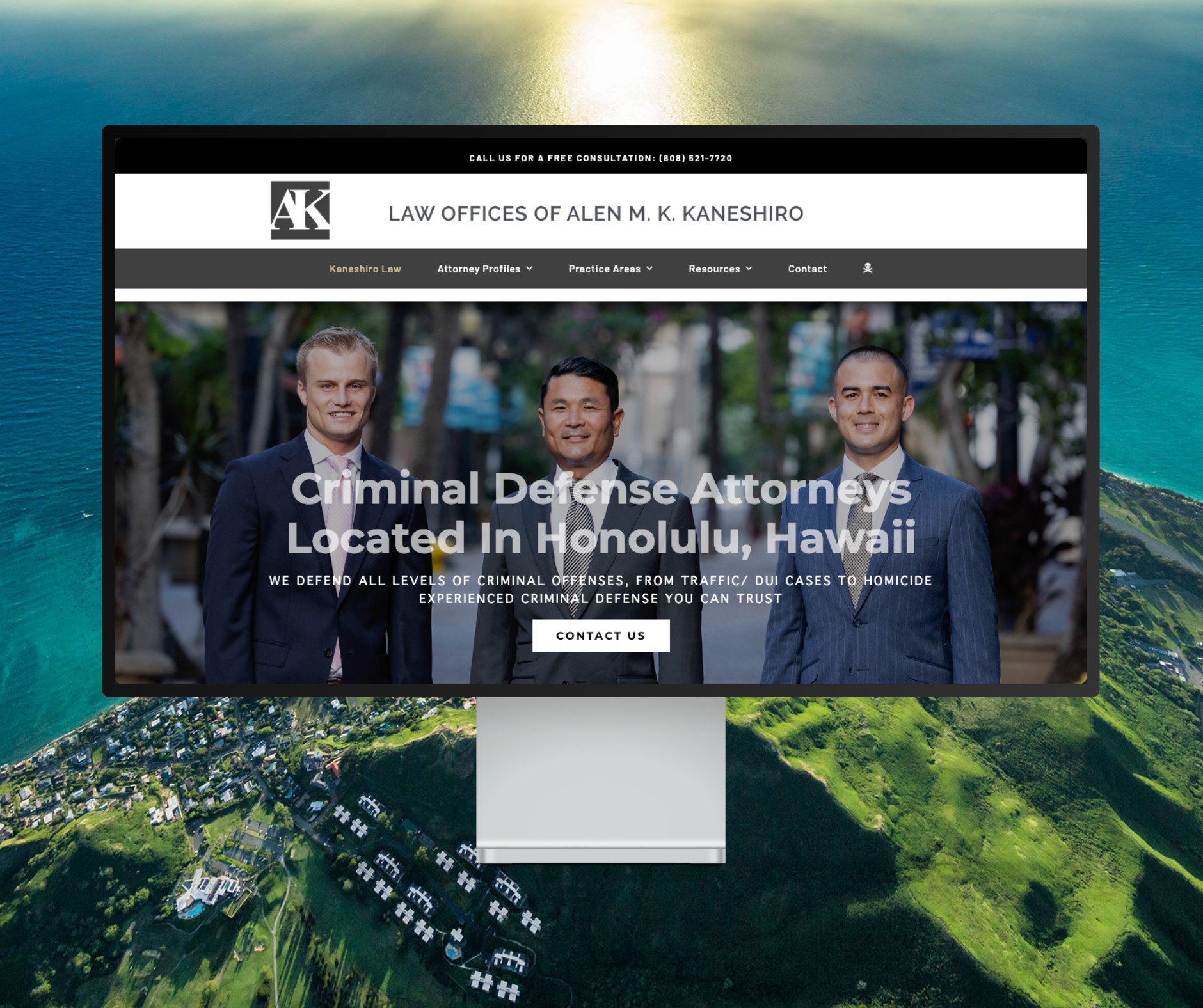
Featured Website: www.kaneshirolaw.com
Kaneshiro Law Firm, one of Hawaii’s most respected legal practices, partnered with The X Digital three years ago for a complete website redesign. Since then, we’ve maintained an ongoing relationship—handling updates, optimizations, and technical support around the clock. Our dedicated team ensures they’re never without assistance, while our enterprise-grade hosting provides 24/7 uptime monitoring and reliability. Kaneshiro Law Firm is one of many long-term clients who trust us to keep their digital presence running flawlessly.